Zeplin Collaboration Tool Review

Lately I have been using a lot application called Zeplin. It is a collaboration tool between designers and developers. The main idea behind is that the designer can upload his or hers designs (mainly Sketch?) to the platform and all the details about it will be processed to easily viewable form. I as a developer have been using the application for a few months now on a daily basis and here are my thoughts about it.

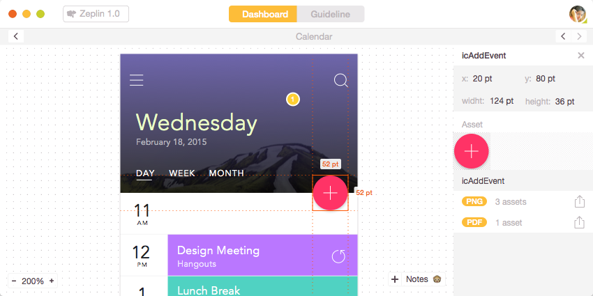
Zeplin allows the developer to see every detail of the design.
Native application vs. Web application #
I’m a Linux user so I have only tested the web application, but as far as I have seen other people use it, they have liked the experience on the native OS X application.
If you are on Linux or Windows, you have use the web application in order to use Zeplin. I fancy the web anyway so I kinda like it being in my browser. I have used Zeplin mainly on Firefox where it works quite nice, some slowness here and there but overall fine.
The User Interface #
The UI is very easy to follow and quite simple. Zeplin seems to be one page application where you are presented with three columns. On the left you have designs of certain project, on the center you’ll see the actual design, and on the right you have details area.
You have the design on your screen and where ever you want to get more details, you on click on it. Pixels, colours, margins, borders, sizes, gradients, you name it. The only thing I have had some trouble have been the text areas where some details have been left out, and I have had to ask the designer for them.
Missing #
There still a lot of work to be done to make it perfect. Maybe in the future we could see automatic CSS lines of certain things. For example Zeplin nicely displays shadows, even every angle of them. But they could also print out the actual box-shadow CSS code.
Designers can put design assets into Zeplin, but we haven’t used the option since we always like to have our images fully optimized, and I don’t see a way to put those images into Zeplin. I may be wrong.
It is funny sometimes to notice a flaw in the design when Zeplin displays all the pixels precisely. Design containing a list could have different margins on the items just because it is unnoticeable on the human eye. But you just have to find the middle value.
Zeplin #
It is a unique idea, and it has made my job a lot easier due not having to interrupt designers all the time with details about the sketch. The pricing is very low, and you can use it for free if you keep your sketches on one project.
Try it out at https://zeplin.io/ I’m sure you will like it, if you do a lot of close designer developer collaboration.
- Previous: jQuery Ajax Example with JSON Response
- Next: Responsive or Mobile site